reading-notes
Mustache and Flexbox
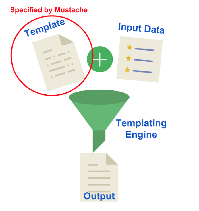
Templating with Mustache
Mustache is a logic-less template syntax. It can be used for HTML, config files, source code — anything. It works by expanding tags in a template using values provided in a hash or object.
Javascript Templating
Javascript templating is a fast and efficient technique to render client-side view templates with Javascript by using a JSON data source. The template is HTML markup, with added templating tags that will either insert variables or run programming logic.
Flexbox
The flex box layout module, makes it easier to design flexible responsive layout structure without using float or positioning.
The main idea behind the flex layout is to give the container the ability to alter its items’ width/height (and order) to best fill the available space (mostly to accommodate to all kind of display devices and screen sizes). A flex container expands items to fill available free space or shrinks them to prevent overflow.

<div class="flex">
  <div>a</div>
  <div>b</div>
  <div>c</div>
</div>
.flex {
  display: flex;
}
Properties for the Parent
1- Flex-Direction.
This establishes the main-axis, thus defining the direction flex items are placed in the flex container.
2- Flex-wrap.
By default, flex items will all try to fit onto one line. You can change that and allow the items to wrap as needed with this property.
3- Flex-flow
This is a shorthand for the flex-direction and flex-wrap properties.
4- Justify-content.
This defines the alignment along the main axis.
5- Align-items. This defines the default behavior for how flex items are laid out along the cross axis on the current line.
6- Align-content. This aligns a flex container’s lines within when there is extra space in the cross-axis, similar to how justify-content aligns individual items within the main-axis.
Properties for the Children
1- Order.
By default, flex items are laid out in the source order.
2- Flex-grow.
This defines the ability for a flex item to grow if necessary.
3- Flex-shrink.
This defines the ability for a flex item to shrink if necessary.
4- Flex-basis.
This defines the default size of an element before the remaining space is distributed.
5- Flex.
This is the shorthand for flex-grow, flex-shrink and flex-basis combined.
6- Align-self.
This allows the default alignment (or the one specified by align-items) to be overridden for individual flex items.